Inside Plaid's Pricing Strategy
How Plaid uses their pricing page to eliminate complexity and drive action.
SaaS Pricing is hard. PricingSaaS is your cheat code.
Monitor competitors, track real-time benchmarks, discover new strategies, and more.
One thing I'm always on the lookout for when visiting a pricing page is whether or not it's easy to navigate for a prospect.
In previous posts, I've referred to this as pricing page empathy. The idea is to design your pricing page so that a visitor can figure out which plan is right for them quickly. Patrick Campbell, our CEO at ProfitWell, has quantified that idea, insisting a prospect should be able to figure out which plan is right for them within 20 seconds.
The idea of pricing page empathy is what drew me to Plaid, and today I want to dive deep into their pricing, packaging, and pricing page design to highlight how they use a minimalist approach to remove complexity and drive action.
What does Plaid do?
According to Technically's Justin Gage:
Plaid acts as an intermediary between apps and your bank so that you can log-in and share data securely.
The classic example of a Plaid customer is Venmo. If you've ever used Venmo to send or receive payments, Plaid built the underlying technology that connects Venmo to your bank, making those seamless payments possible.
Put simply, Plaid takes data that's stored in financial institutions and difficult to access and makes it legible for apps. Within this wider value proposition, they offer a number of products based on the type of financial data the app wants to surface. This includes:
Transactions: Plaid can surface real-time transaction updates and categorize those expenses.
Authorization: Plaid can instantly connect a bank account by authenticating account and routing numbers.
Balance: Plaid can surface real-time account balances.
Identity: Plaid can verify the identity of an account holder using their bank data.
Investments: Plaid can understand a user's investments, including balances, holdings, and transactions that impact a holding.
Assets: Plaid can provide a holistic snapshot of a user's financial situation so institutions can decide whether or not to make a loan
Liabilities: Plaid can surface a user's loan data and contextualize balances, payment terms, and timing.
Given this range of products, unsurprisingly, Plaid has a nuanced pricing strategy.
Multi-Product Pricing
Depending on the product, Plaid’s pricing model varies. Specifically, Plaid has 3 pricing models: one-time fees, subscription fees, and per-request flat fees.
To understand each payment model and how it applies to Plaid's products, let's analyze how each model works for one of their customers, Qapital.
Qapital is a personal finance app designed to motivate members to save money through gamification of their spending behavior. To enable this functionality within their app, Qapital uses several Plaid products, touching on each of their 3 pricing models.
One-Time Fees: To monitor a member's savings, Qapital needs to connect to their bank account. To do so, Qapital uses Plaid's Auth product to authorize the account and verify their identity. Since these tasks only need to happen once, Plaid charges a one-time fee for each instance.
Subscription Fees: To understand how members are spending their money, Qapital needs visibility into their transactions. To do so, Qapital uses Plaid's Transactions product to connect to user accounts and view their transactions. Because this is an action that happens repeatedly, it's billed as a recurring subscription fee. Specifically, Transactions are charged per connection per month, or every time Qapital needs Plaid to ping a user's bank account to check their transactions. As you can imagine, some fintech apps make tons of these connections. Because of that, Plaid offers serious volume discounts.
Per Request Fees: Qapital also allows members to make transfers between accounts. To do so, they need to make sure the transferring account has enough money to transfer. In these cases, Qapital uses Plaid's Balance product to check a member’s account and ensure the transfer will clear. For these types of requests, Plaid charges flat per-request fees.
I know this is a lot, but it's helpful to have context when analyzing Plaid's pricing strategy. If they were to include all of this context on their pricing page, it could get confusing very fast. Given the complexity of blending these models, you may be surprised by the simplicity of Plaid's pricing page:
As you can see, Plaid's pricing page isn't designed to make prospects pick between plans, but more-so to guide them along an intuitive path to get comfortable with the product before contacting sales and setting up an account that suits their needs.
The real differentiation in Plaid's prices happens offline and is based on the specific products a company needs and their expected usage volume. Those sales conversations are likely very nuanced, with details that would be difficult to communicate without context. With that in mind, Plaid structures its pricing page to ensure that to get set up with a real account, prospects need to talk to sales, and before they do that, they have ample opportunity to play around with the product to understand their needs.
In the same vein as products like Twilio and Stripe, Plaid offers usage-based pricing that gives developers the chance to build a business case and get a feel for the product before contacting sales to discuss a larger commitment.
Sequenced Packaging
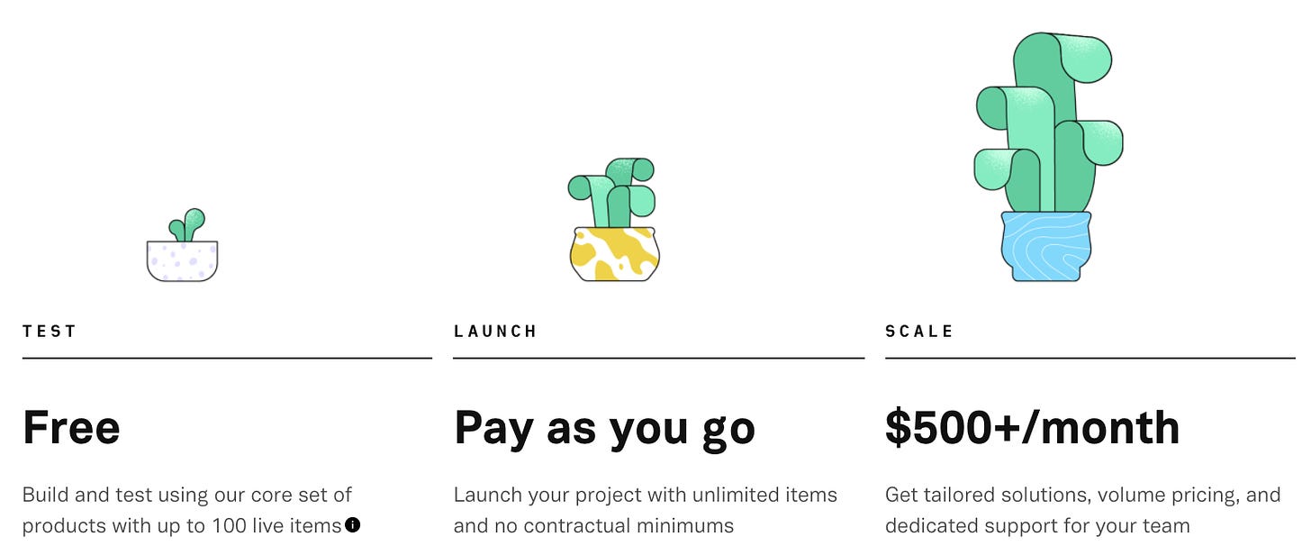
Specifically, Plaid offers 3 plans, with an intuitive maturity curve that allows users to get started and upgrade as needed. Unlike many SaaS products that have differentiated plans for different market segments, Plaid's tiers are structured as a step-by-step process to get users comfortable with the product before requiring a substantive investment.
First, developers can sign up for a free plan where they can connect to 100 bank accounts and test sample data in a sandbox environment. If they like what they see, they can move along to the next plan to try it out with real data.
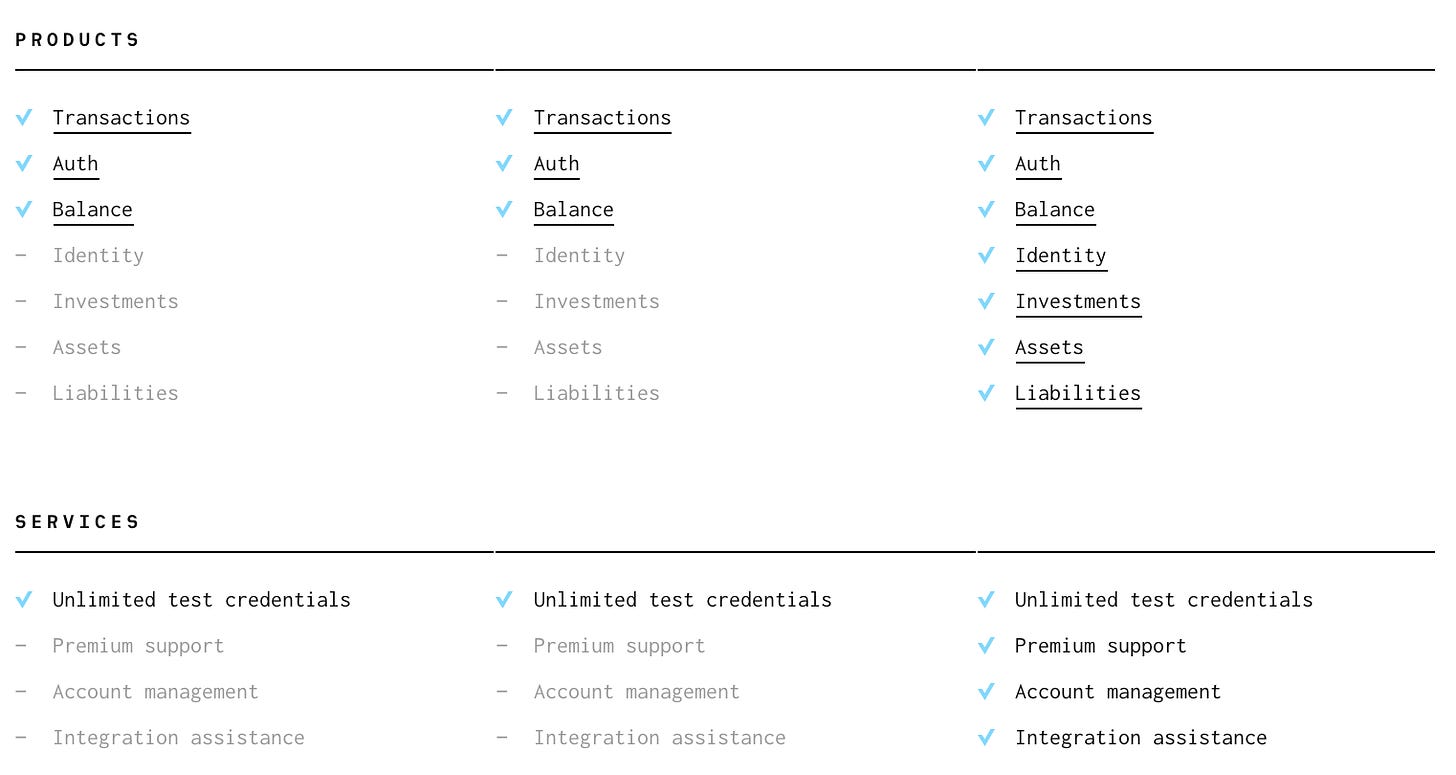
Next up is Plaid's Pay-as-you-Go option. Notably, Pay-as-you-Go only offers access to Plaid products that align with a Pay-as-you-Go pricing model. That includes products within the one-time fee and pay-per-request categories. Specifically, users can authorize accounts and check transactions and balances.
To access the full breadth of Plaid's solution, users have to upgrade to the subscription plan, which starts at $500 per month. As noted earlier, actual costs vary widely based on volume, and Plaid's sales team helps prospects figure out what makes the most sense based on their current and future usage.
It's worth double-clicking on this for a second. One of the biggest benefits of having a usage-based component to your pricing is that if it aligns with customer growth, the pricing conversation can be far more subjective. Rather than pricing being a black and white exercise, the Sales team can take a more consultative role with customers to help them choose a plan and usage level that accounts for their future growth. Often, this means Account Executives will recommend customers start at a usage-level beyond their current needs and discount down to the price of their current usage level.
While I have no experience with Plaid's sales team, I wouldn't be surprised if this dynamic is common, especially with Enterprise prospects. From the limited social proof I could find on their sales process, it seems like they're genuinely helpful and easy to work with.
Pricing Page Design
Beyond the nuts and bolts of Plaid's pricing strategy, the design of their pricing page is what initially pulled me in.
The first thing I love is the intuitive sequence of plans, and that each plan is action-oriented with a specific call-to-action.
The free Test plan pushes visitors to Get API Keys, which will allow prospects to play around with sample data in a sandbox environment.
The pay-as-you-go Launch plan pushes visitors to Request Access, and get started with a new account.
The subscription-based Scale plan includes holistic functionality and premium support, pushing visitors to Contact Sales to determine the solution that works best for them.
This alignment between action-oriented plans and relevant calls-to-action helps prospects quickly and easily understand where to start depending on where they are in the process. It's an incredibly easy pricing page to navigate and leaves visitors knowing exactly what they should do in well under 20 seconds.
Another factor that emphasizes this idea of pricing page empathy is the minimalist simplicity of their feature differentiation. In the context of many pricing pages having cluttered, disorganized feature breakdowns, Plaid's is a breath of fresh air.
For each feature, there's a hyperlink that visitors can click to learn more. By pushing visitors to another page for more details, Plaid keeps their pricing page clean and readable and allows visitors to understand what's included with each plan within seconds.
Final Notes
If there's one theme I love about Plaid's pricing strategy and how it translates to their pricing page, it's how they find ways to remove or defer complexity. While not every company can fully embrace their approach, I do believe there are some widely applicable takeaways.
Drive Action: Utilize specific CTA's that align with each plan to guide prospects toward a specific next step.
Defer Complexity: If your pricing strategy is nuanced enough to be misunderstood, don't let prospects struggle. In Plaid's case, they ensure serious prospects talk to sales rather than adding a rate card or pricing calculator to their public pricing page and risking confusion.
Avoid Clutter: Feature descriptions can get exhausting, and cluttered pricing pages are hard to digest. Rather than trying to jam as much detail as possible into their packaging grid, Plaid guides prospects to another page to learn more.
I don't necessarily believe every solution has the opportunity to make their pricing page as clear and direct as Plaid. Sometimes, nuance is necessary, which makes it difficult to strip things down to such a minimalist extent. That said, Plaid is a solid example to follow if your current pricing page feels unnecessarily complex.
Enjoying Good Better Best?
If you enjoyed this post, I’d love it if you hit the like button up top, so I know which posts are resonating most!


I see now plaid has been integrated with jika.io
Plaid's pricing page is visually appealing, but it is anything but clear. "Free" is self-explanatory, and the "at scale" $500/mo price, but anyone launching an app (and shopping for this service) needs to understand the "launch" pricing. "Pay as you go" is not something I can plan for. Is it $100 transaction? A penny? Is there a cap? NOT helpful.