🔻 SaaS Pricing Tracker 🔻
🌱 Sprout Social introduced a feature to ‘Organize Tags’ in the Advanced plan.
👩💻 Slack introduced an AI add-on to the Enterprise Grid plan.
💬 Postscript added a minimum spend to the Starter plan.
🌎 Webflow added a Localization add-on to multiple plans.
🍯 Honeybook introduced a 50% off promotion for annual plans.
PS. Wondering where these alerts come from? I spotted them using PricingSaaS. We keep the pulse on the SaaS market by tracking moves across 3k+ companies.
We help SaaS operators and investors stay ahead of the curve through software, services, and support.
Welcome new subscribers, and happy Friday!
This post is the third in a 4-part series with the team at Maple Street Advisors. You can find the link to parts I & II below.
As a reminder, our goal with this series is to provide a go-to guide for pricing research from data collection through implementation. We’re breaking the posts down as follows:
Guide to Pricing Research, Part II (Internally Sourced Data)
Finding a Story in Pricing Data ← Today 🙂
Q&A with Pat Meegan about Pricing Implementation
PS. Take the Maple Street Pricing Strategy Assessment to identify pricing opportunities at your company.
Finding a Story in Pricing Data
Over the past two posts we’ve gone deep on how you can collect data to inform your pricing strategy. Data is great, but only if it’s actionable. One of the best ways to go from insights to action is by visualizing your data to understand the story.
There are several visual representations that can help highlight areas of opportunity, whether it be adjusting price points, introducing a usage-based metric, re-packaging features, or taking advantage of a competitive opportunity. Below, Pat and I are sharing some of our favorites. Importantly, all of these are relatively easy to execute.
I. Relative Preference Segmentations
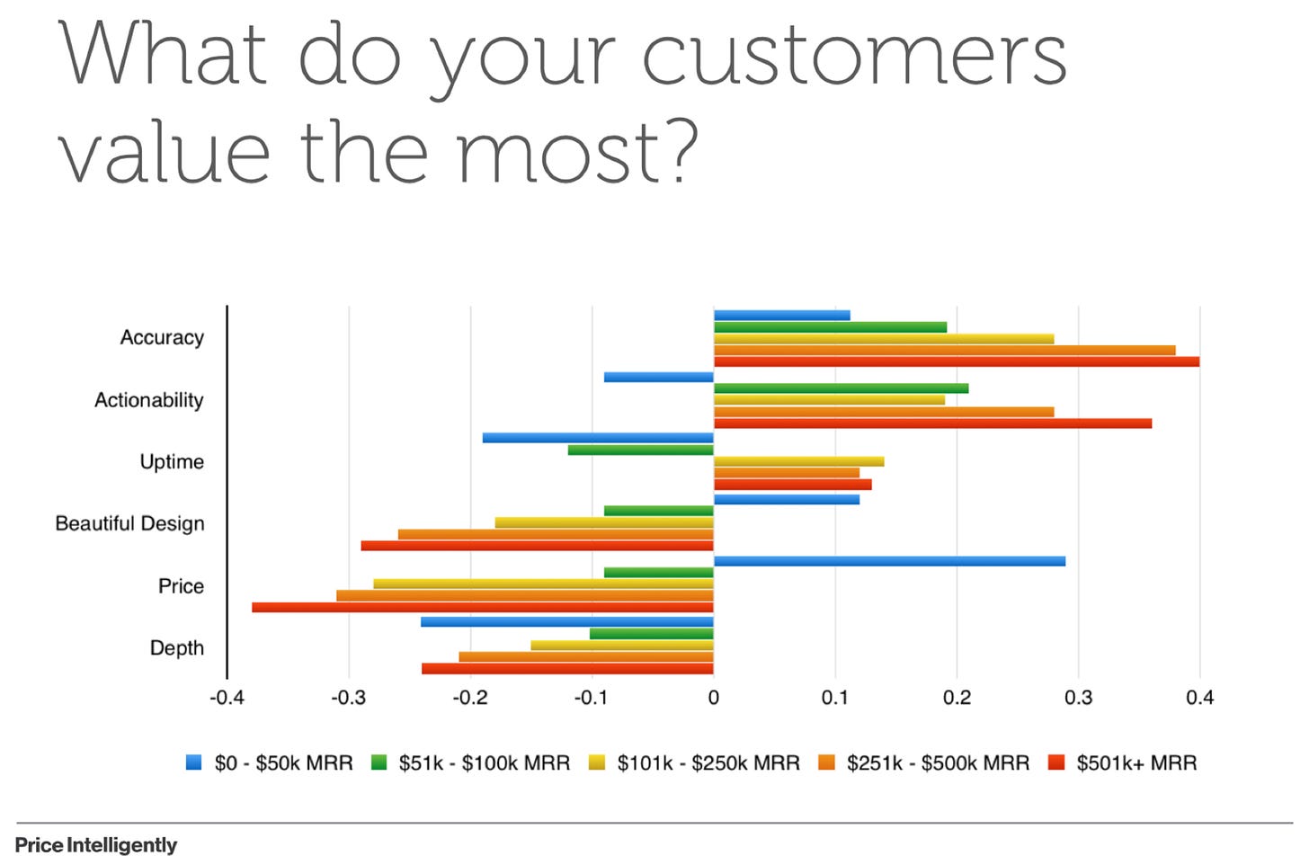
When determining how to package different features, it’s helpful to understand how features intersect with other variables. For instance, does interest in a feature scale with company size, revenue, or number of users? If so, you likely have a solid differentiator on your hands.
For example, in the visual below, Accuracy, Actionability, and Uptime scale with company revenue. That signals to me that features aligned with those value props are good candidates to differentiate plans.
II. The Value Matrix
I’ve written about the Value Matrix before, and I’ll write about it again. It’s a powerful deliverable that clients absolutely loved at ProfitWell.
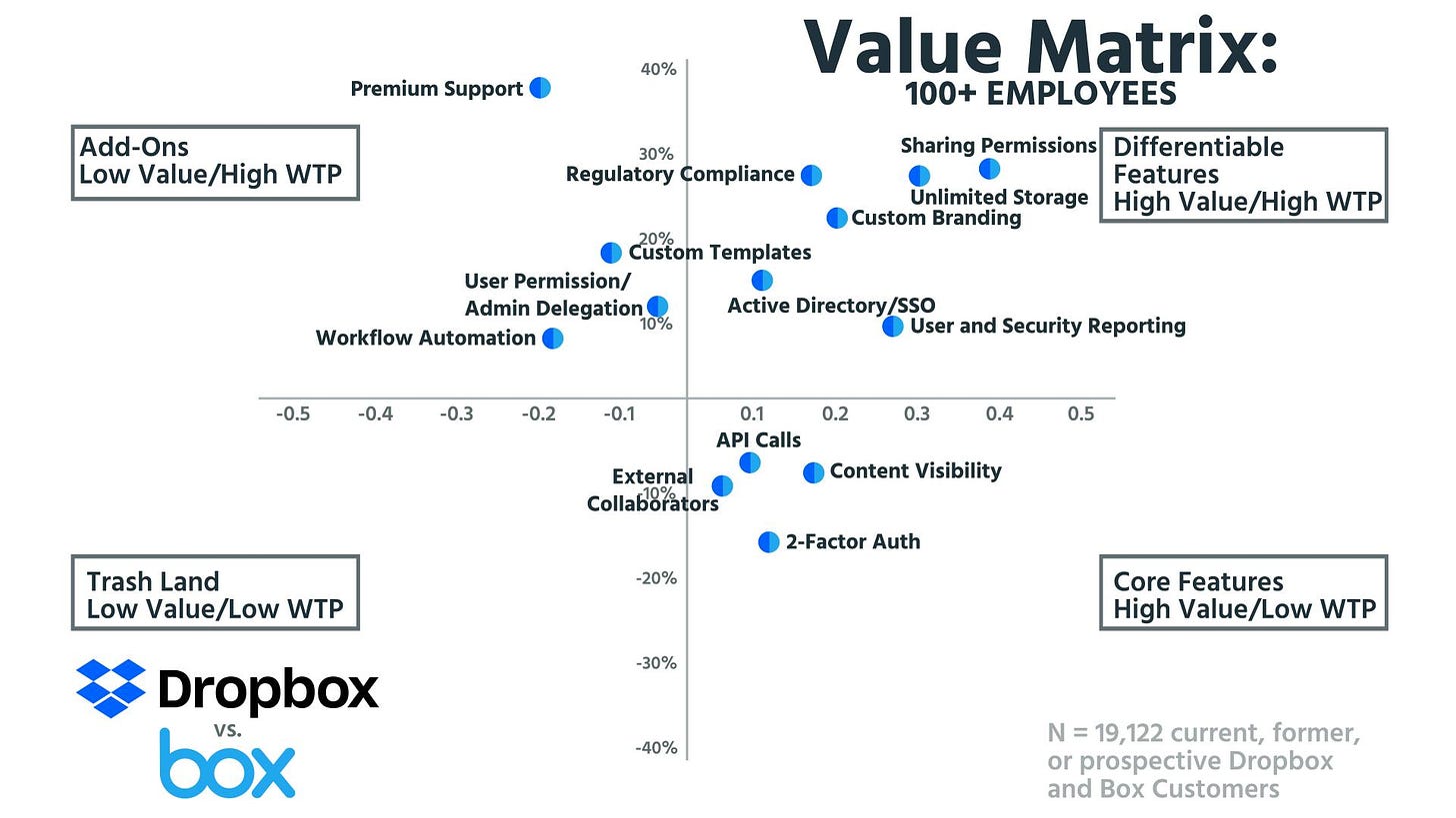
The value matrix helps visualize how feature preferences intersect with willingness to pay in an output that looks like this:
The beauty of this matrix is that each section of the grid illustrates where a feature should fall in your packaging strategy (e.g., Core, Differentiator, Add-On). I’d caution you against using this visual alone to steer your pricing and packaging strategy, but it’s one of the most useful tools I’ve found to immediately steer pricing conversations.
III. Pricing Bands
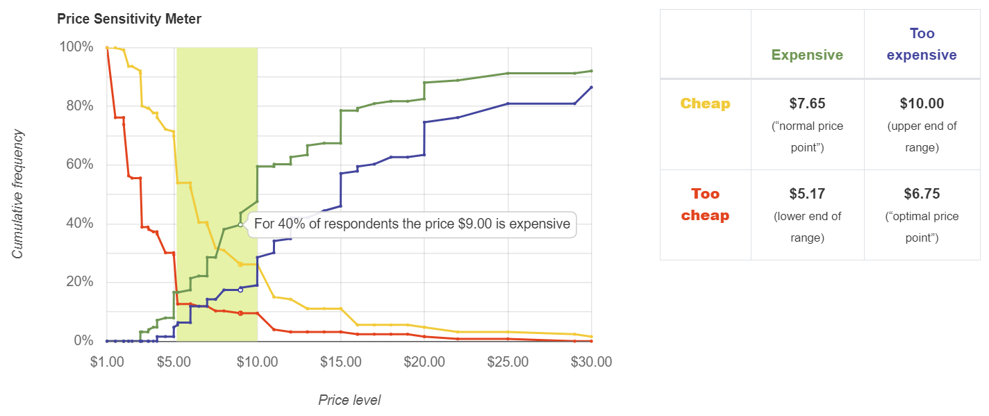
The Van Westendorp price sensitivity methodology produces the output below:
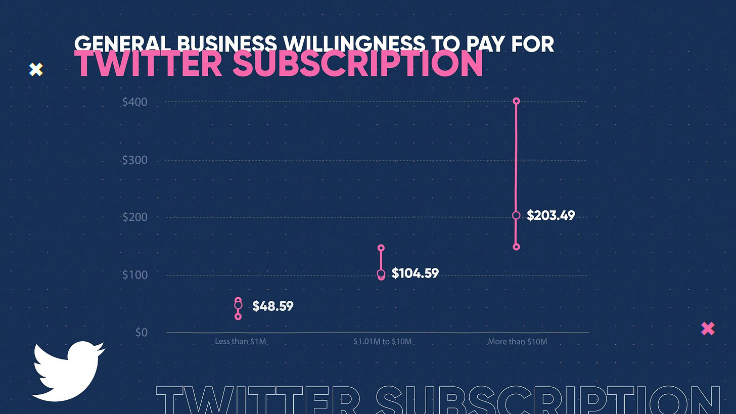
While I do find this helpful, if you have a big enough sample within various segmentations, I prefer translating this grid into pricing bands.
By looking at willingness to pay across your most important segmentations, you can very easily determine if a particular value metric makes sense. You can also get a ballpark sense for price points. For instance, the example below is from an old episode of Pricing Page Teardown, and shows willingness to pay for a Twitter subscription by company revenue:
IV. Incremental WTP
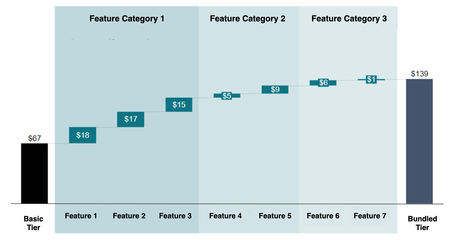
Conjoint is a powerful survey methodology for a number of reasons, but one of the biggest is that it can help you isolate the willingness to pay for discrete features within your product. The visualization below shows how this might look in practice:
This can tell you right away whether there are opportunities to increase prices, or if you have easy add-on opportunities.
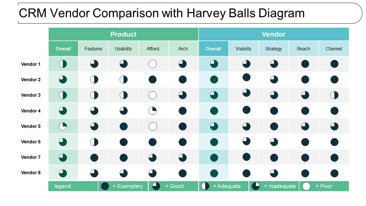
V. Harvey Ball Chart
Visualizing competitive comparisons can be challenging, especially if the research is qualitative. Thankfully, this has been a challenge for consultants since the dawn of time, and back in the 70s, a man named Harvey Poppel, who worked in Booz Allen Hamilton’s IT consulting practice created the Harvey Ball visualization.
While they’re not perfect, Harvey Balls can be an extremely helpful way to visualize a large volume of information.
Visualization-to-Pricing Model
Once you’re able to visualize your data clearly, you can actually start putting together the pieces of your pricing model. From there, the key is pressure-testing your pricing across the most relevant functions in your organization. I’d encourage you to pull in leaders from across your org and ask them the following questions:
Product — Is it clear why each package exists?
Marketing — Is it clear who each package is for?
Sales — Are there any obvious bottlenecks that will stall deals?
Success — Is it clear how a customer’s account can grow over time?
Finance — Does the pricing model fit within our economic guardrails?
Once you’ve pressure-tested across these axes, you’re ready for implementation — which will be the topic of our next post.
That’s all for today. Thanks for reading! Tune in next time for our guide on using internal data to make pricing decisions.
Whenever you’re ready, there are a few ways I can help you:
PricingSaaS Software: AI-powered pricing alerts for PLG SaaS companies.
PricingSaaS Services: Rapid research and ongoing support for growing SaaS companies.
Pricing Coaching: Schedule a call with me to talk through your pricing challenges and determine the best course of action.


