SaaS Pricing is hard. PricingSaaS is your cheat code.
Monitor competitors, track real-time benchmarks, discover new strategies, and more.
This week, I listened to a great episode of the Invest Like the Best podcast titled The Art and Science of the Bundle. The episode features Shishir Mehrotra, who used to lead product at Youtube, sits on the board at Spotify, and is now CEO of a company called Coda. Coincidentally, my cousin CJ also sent me the accompanying essay titled Four Myths of Bundling. I highly recommend both if you’re interested in bundling strategy.
The episode led me to check out Coda, which loosely competes with Notion. From what I can tell, users love Coda and I have no doubt it’s a great platform. That said, their pricing page is a stark contrast to the concept of “pricing page empathy” that I wrote about in regard to Notion last week.
As a refresher, the idea of pricing page empathy is that a potential user should be able to visit your pricing page and quickly understand which plan is right for them. This is especially important for self-service products. After digging on LinkedIn, I could only find one Coda salesperson, an Enterprise Account Executive, which confirms most of their customers sign up through the website.
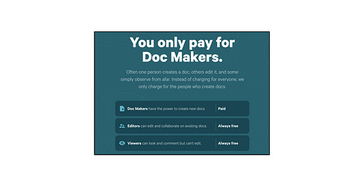
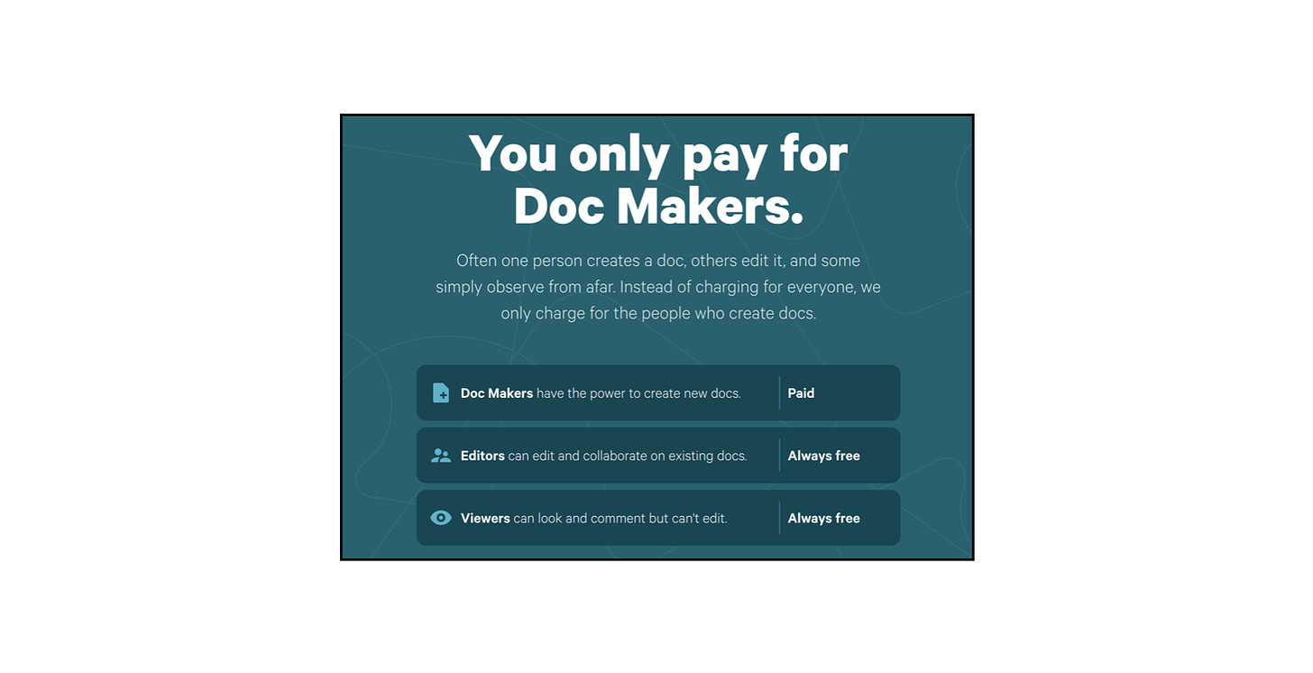
The first sign that the pricing page is not very intuitive is the key at the top defining different types of users:
While I understand the concept of Doc Makers, Editors and Viewers - it’s not immediately clear who a Doc Maker might be at a given company, so I’m already confused.
Next, there’s a calculator to help figure out monthly costs with dropdowns for team size, number of Doc Makers, and chosen plan:
This calculator is helpful, especially since Coda is self-service, but I haven’t even seen the plans yet, so it feels misplaced.
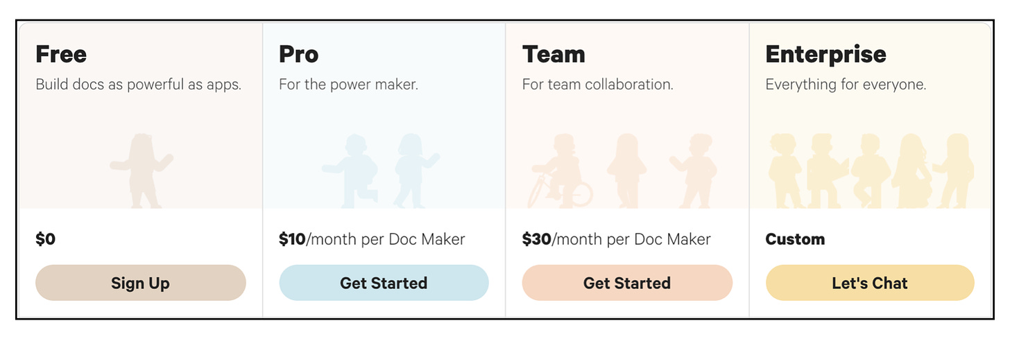
Next, let’s look at the plan descriptions.
This is the place to make it explicitly clear who each plan is meant for. With that in mind, I’m already confused for a few reasons…
The tagline for the Free plan is “Build docs as powerful as apps.” This description is pretty nebulous to me. Maybe others will get it, but I don’t.
Second, the tagline for the Pro plan is “For the power maker” which suggests it’s for one person, but the icon has two people. Can teams get by with the Pro plan? If so, this messaging is contradictory.
Lastly, there are several examples of ambiguous language on this page. Take, for instance, Automations. In the context of their packaging model, Automations is an important differentiator, as it’s the only consumption-based limit between the Pro and Team plans.
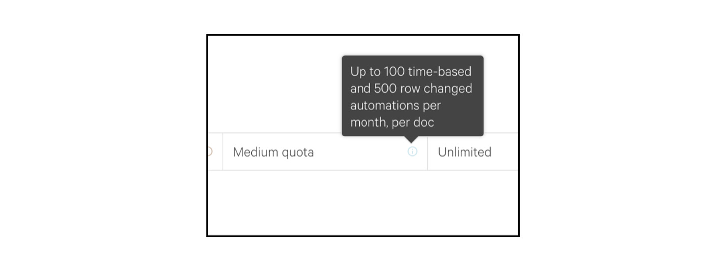
Upon inspection, I was immediately confused by the language around “quota” and decided to click in to see what a “Medium quota” entails:
The pop-up box says:
“Up to 100 time-based and 500 row changed automations per month, per doc”
Without a firm grasp of the product, this is very difficult to understand. There are a few more examples like this on the pricing page, and I don’t want to belabor the point, but the bigger takeaway is that there seems to be a lot of education needed here for a self-service model.
Maybe I’m just not the target buyer, and Product Managers would understand this pricing page better.
That said, from what I understand, Coda is trying to change how we think about a traditional doc. When I think of the best brand I’ve ever seen at affecting change, it’s Apple, and I think Coda could take cues from their messaging simplicity.
As a first step, I’d encourage Coda to summarize the differences between each plan more clearly at the top of the page, then allow people to dig into the nitty-gritty below.
For more on pricing page empathy, check out this post on Notion:


