Welcome back to Good Better Best!
Today, we’re going back to our roots and dropping a pricing page retrospective from one of my favorite players in SaaS: Miro.
At the end, I’ll drop my 3 favorite moves by Miro that any SaaS company can learn from. Let’s get to it.
Today’s post is sponsored by Schematic. Most startups use Stripe for billing, but quickly realize they need more infrastructure for pricing & packaging.
This includes admin dashboards, feature flags, entitlements, and UX for plan management (upgrade paths, usage meters, portals, etc).
Developers shouldn’t have to build any of this — it’s not core to the product. Schematic calls this "the last mile of pricing & packaging."
Sign up for a free trial of Schematic.
🚨 SaaS Product and Pricing News
Unbounce updated its hero copy and adjusted the pricing page format.
ZenHub introduced a free plan.
TailScale introduced a new Personal Plus plan.
Whimsical removed "Unlimited Guests" from the Free plan.
FreshBooks introduced a 50% discount for 6 months across all plans.
Couchbase introduced a Free plan.
Carta added value to its Free plan.
ConvertKit rebranded and updated positioning for Creators.
Miro: A Pricing Page Retrospective
Pricing pages reveal more than just numbers.
They’re where product meets strategy—a powerful snapshot of how a company blends value, positioning, and pricing into a cohesive story.
Take Miro, for example.
In the past 18 months, Miro has tweaked its pricing page 10 times—without changing its price points once.
Curious how they did it? Let’s break down the timeline and uncover what’s going on behind the scenes.
Q2 2023: GTM Moves
Last April, Miro made three bold moves:
Unlocked the free plan to unlimited users.
Switched the business plan CTA from “Try it Free” to “Buy Business.”
Lowered the user minimum on the Enterprise plan from 50+ to 30+.
The results? They streamlined acquisition, shifted focus away from free trials, and made Enterprise adoption more accessible.
Q4 2023: Aligning Product + Positioning
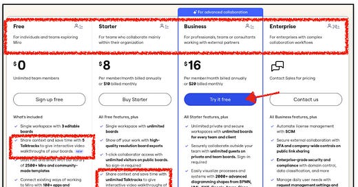
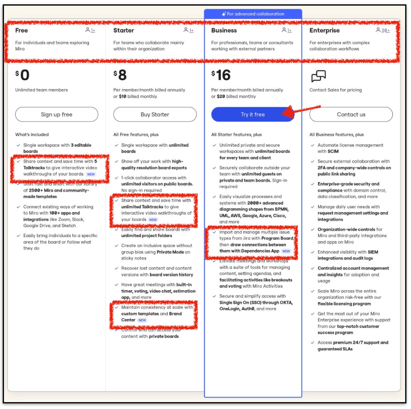
Later in the year, Miro shook things up with major pricing page updates:
Positioning: Tailored each plan to specific user profiles.
Product: Rolled out new features across the board:
“Talktracks” in Free and Starter plans
“Private Mode on sticky notes” and “Brand Center” in Starter
“Program Board” and “Dependencies App” in Business
GTM: Reintroduced the free trial for the Business plan.
These moves sharpened Miro’s focus, aligning each plan perfectly with user needs and personas.
Q1 2024: Positioning Tests
To kick off the year, Miro rolled back to its previous plan descriptions with a twist—links in each plan, like:
“Watch Video” for Starter and Business
“Why Upgrade” for Enterprise
Adding links here is an interesting play. Normally, your pricing page should give enough info upfront. But if Miro’s tracking these clicks and tying them to users in their CRM, it could signal buying intent—or at the very least, trigger a follow-up from Sales.
Q2 2024 — Plan Description Refresh
In Q2, Miro got rid of the description links, shifted to a cleaner font format, and shifted from icons showing user minimums, to “per month per member.”
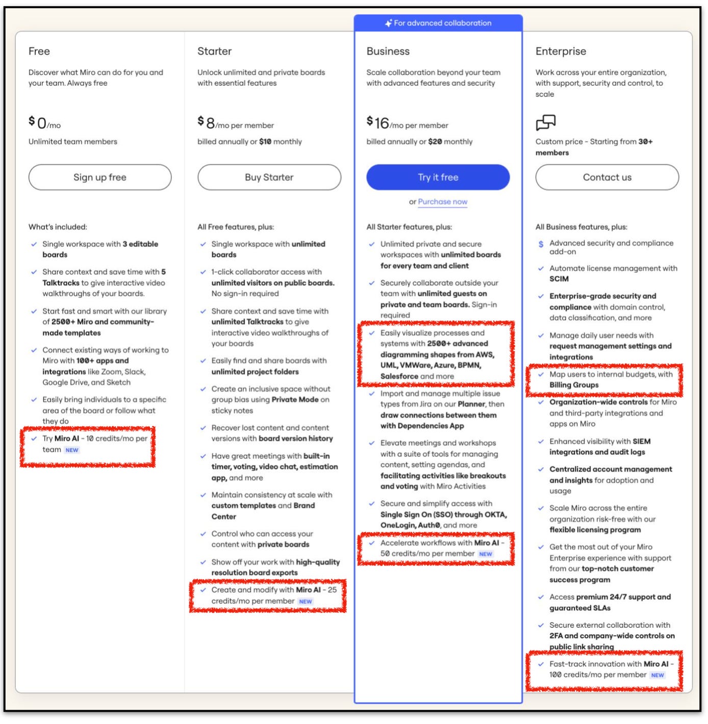
Q3 2024 — Miro AI + Product Additions
In Q3 this year, Miro made some cool product updates, including:
Launching Miro AI, with a “per member” credit limit that scales with each plan.
Adding 500+ diagramming shapes to the Business and Enterprise plans.
Introducing a “Billing Groups” feature to the Enterprise plan.
Favorite Takeaways
Miro isn’t afraid to experiment with their pricing page—and I love it. A great example is their plan descriptions. They tested user-profile-centric descriptions, but eventually scrapped them when they didn’t see an uptick.
Personally, I liked the targeted descriptions, but it seems Miro’s personas move fluidly between plans, so they don’t feel the need to lock plans to specific profiles.
So, what can we learn from Miro’s moves? Here are my top 3 takeaways:
1️⃣ Miro AI Pricing: Their “per member” credit limit scales with each plan—perfect for driving upgrades as users hit their monthly limits.
2️⃣ Unlimited Free Users: Letting free users truly explore the product without restrictions is a brilliant way to show how the platform fits within an organization. Miro does this perfectly.
3️⃣ Multi-Plan Feature Updates: Adding value across all plans at once? I love it. Miro’s done this several times, and they’ve got more on the way. This is how you build a userbase that loves your product.
Thanks for tuning in and see you next week!
Our goal is to make pricing easier for SaaS operators. Here’s how we help:
📈 PricingSaaS: Our database of SaaS pricing news, examples, and trend reports.
🔋 Pricing Power Hour: A 1-hour pricing assessment for SaaS startups and scaleups. Schedule a free call here.


