SaaS Pricing is hard. PricingSaaS is your cheat code.
Monitor competitors, track real-time benchmarks, discover new strategies, and more.
Happy Saturday and welcome new subscribers,
A quick announcement before today’s post — Good Better Best now has a referral program! I’m keeping it simple, with 3 rewards that make SaaS pricing easier.
1 referral — The SaaS Pricing Link Library 🔗
A curated list of my go-to resources, organized by topic (Pricing, Packaging, Bundling, Freemium, Psychology, etc.) and format (articles, podcasts).
3 referrals — PricingSaaS Slack Access 💥
PricingSaaS is a lightweight pricing intelligence product for SaaS founders and product owners. I met the founder John in May, and we’ve been building the product together ever since. In Slack, we’re tracking pricing changes across the biggest players in SaaS, following PLG experiments, and more.
5 referrals — Free Pricing Page Assessment 🔬
A 30-minute call with me, where I’ll review your pricing page and offer feedback and recommendations.
Hit the button below to find your unique referral link and get started.
Why Changing your Pricing Page Isn’t a Dig Deal
A little while back, I read a book called Little Bets by Peter Sims. The book argues for small-scale experimentation over top-down, procedural planning, and includes tons of examples. There’s a quote from the book that I love:
Do things to discover what to do.
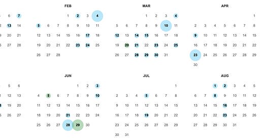
I think this is highly relevant to SaaS pricing, which people can overcomplicate quickly. I was doing research on one of my favorite SaaS companies, Loom, and found this:
Each of these bubbles signifies a change to their pricing page. While it may seem like a lot, I’d argue they could do even more.
As you’ll see below, Loom hasn’t made any seismic pricing shifts, but has placed a series of little bets that have improved their pricing strategy over time.
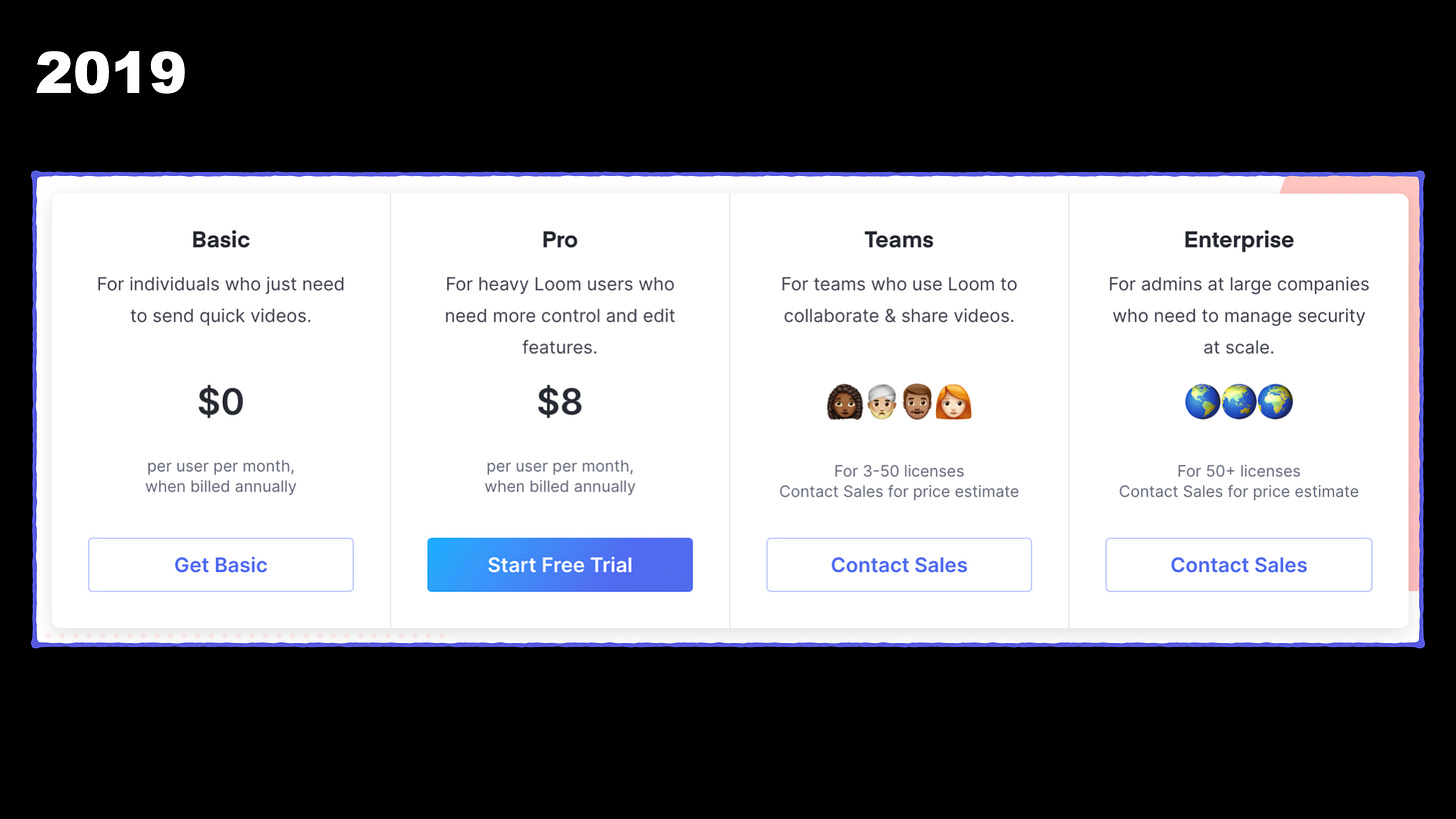
Back in 2019, Loom offered 4 plans, including a free plan and a Prosumer plan for $8 per month.
In 2020, they consolidated the Prosumer and Teams plan into one Business plan, and raised to price to $10 per month.
Note: I love this move — it clarifies Loom’s positioning and allows them to leverage the compromise effect.
In 2021, Loom tweaked the CTAs on its pricing page, presenting a relevant action step for each plan.
In 2022, they refreshed the design of the pricing page, simplifying the style and color scheme.
This year, Loom tweaked the positioning of each plan — targeting personas instead of highlighting feature themes.
As you can see, none of these changes are earth-shattering on their own. They’re low-pressure, iterative changes that have allowed Loom to test what performs.
The result is a polished pricing page that allows a potential customer to understand exactly which plan is right for them, and how to get started in less than 10 seconds.
Thanks for reading! If you enjoyed this post, consider liking it, subscribing, or sharing with a friend so Substack shows me some love.


