How Curation Ate The Economist
Or how a 175-year old institution transformed itself to serve the modern reader.
SaaS Pricing is hard. PricingSaaS is your cheat code.
Monitor competitors, track real-time benchmarks, discover new strategies, and more.
Happy Thursday y’all,
Hope you’re healthy, safe, and able to get outside to enjoy some sunshine!
There’s a legendary bar in Charlestown called the Warren Tavern. It’s been around since 1780, and rumor has it that both George Washington and Paul Revere visited the place to enjoy a pint. I used to love sitting down at my barstool and thinking that America’s founding fathers might have sat in the exact same seat a couple hundred years before me.
Building a successful business is hard enough, but lasting hundreds of years feels borderline impossible. In that context, it’s so impressive to me when a business can adapt and last. The Economist is one of those brands. James Wilson founded the newspaper in 1843 to “take part in a severe contest between intelligence,” and the first issue looks like the type of reading material that could have graced the bartop at the Warren Tavern:
Along with maintaining a reputation for balanced, factual reporting across multiple generations, in recent years, they’ve managed to execute an underrated digital transformation. In the face of legacy publishers struggling to maintain relevance, The Economist is still going strong with a global circulation of 1M+. Today, I want to unpack one of the reasons why.
Curation has become an essential capability for modern publishers of all types.
Newsletters like The Hustle and theSkimm have made curation their primary feature - scanning the ether and wrangling the meaningful for their audience.
Netflix and Spotify have made curation a huge part of their value prop - offering customized recommendations to help subscribers cut through the clutter.
Simply put, we're living in the era of abundance and curation helps combat information overload. In this context, one of my favorite case studies on the importance of curation comes from a nearly 200-year-old publisher with a legacy of breadth and depth, The Economist.
Economist Espresso ☕️
Back in 2014, the team at The Economist noticed the tide changing and embraced the reality that mobile devices had permanently altered news consumption. Understanding that most people reach for their phones within a few minutes of waking up, the team set out to design a product tailored to mobile usage patterns.
First, they had to determine the right delivery cadence. Traditionally published weekly, they started thinking about how a daily version of The Economist might look. At the same time, they didn't want to add to the feeling of information overload that readers were experiencing.
With these seemingly conflicting goals in mind, they developed Economist Espresso, an app that surfaces the most important stories in the world and delivers them as a daily morning briefing. In an interview in 2015, Head of Client Marketing, Jamie Credland, stated the purpose of the app:
The idea is that you finish it in 5 minutes each day, that’s it. Like a shot of espresso.
Giving Espresso a finite feel is key to the user experience, and to make that happen, the team made a conscious choice to make the app self-contained. Here's Credland again:
The premise is that by the time it appears in The Economist, all the various facts and angles have been taken into account, and a considered viewpoint on the subject is given. This is exactly what we are looking to recreate in Espresso, simply on a daily instead of weekly basis. If it was filled with links to other articles, readers may feel that they have not yet got the full picture until they have clicked off to the other sources to find out more.
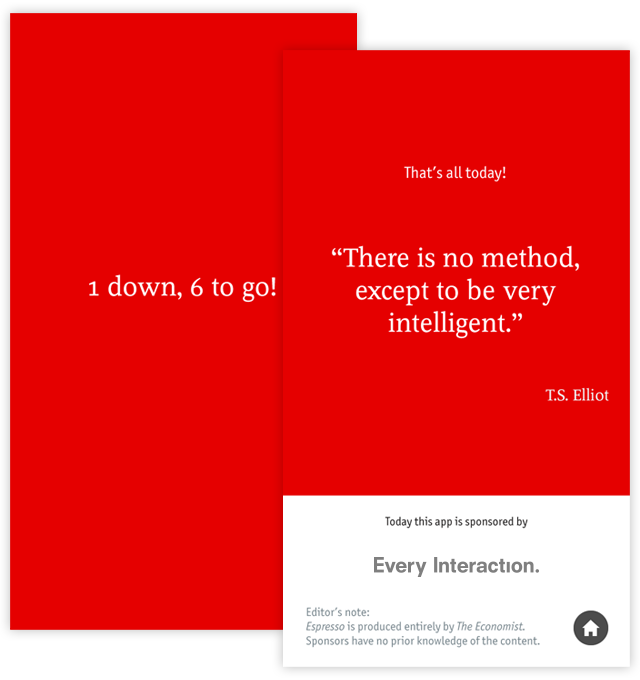
In addition to offering a feeling of completion, the app also tracks how many articles you've read at the bottom of the screen, and rewards you with a daily quote when you finish, creating a sense of gamified achievement.
As an Economist subscriber who regularly had a pile of unread issues on the coffee table, Espresso is pretty much exactly what I was looking for. It turns out I wasn’t alone - Espresso established product-market fit early - reaching #1 in the news category of the app store.
When the app launched in 2015, it was geared towards existing subscribers as a retention tool. However, offering a stripped-down version of their product also gave them a low-cost alternative to fuel subscriber acquisition as well.
The Economist currently offers digital-only subscriptions at $189 per year and print+digital subscriptions at $225 per year. At $60 per year, Espresso gives The Economist entry into a completely different price range.
Along with attracting new readers who are too price-sensitive for the flagship subscription, it also provides a safety net for existing subscribers to fall back on if they find the full subscription to be too exhaustive. However, after seeing the success of Espresso, The Economist team took reader exhaustion head-on by making curation a staple of the flagship app as well.
The Economist Proper 📰
In their first attempt at creating a digital app, The Economist tried to replicate the print experience but quickly realized the challenges of depth and breadth in a digital format. Deputy Head of Product Richard Holden commented on this dynamic in an interview in 2018:
People can start to feel guilty if they’ve got a pile of print editions or a load of bookmarks. So, rather than enjoying reading the Economist, you’ve got a situation where readers start to feel a bit guilty. We don’t want readers to give up; we want to make it even easier for them to get value from The Economist without feeling they have to read it all. That’s where our focus on curation comes in. It’s our service to make life less complicated and the experience more enjoyable.
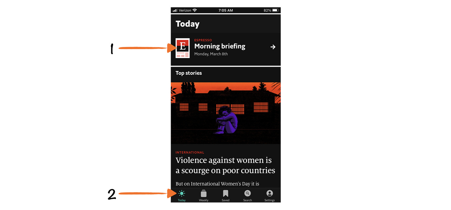
In this context, upon opening The Economist app, the first thing you'll notice is a callout to Espresso at the top of the screen:
You’ll also notice that the app opens on the Today tab, which surfaces curated picks from the editorial team for the day. This organizing function starts subscribers in a more manageable place than the entire weekly edition, which can have upwards of 75 articles.
Here's Richard Holden on this strategic choice:
Yes, the full print edition is available in the app, but it’s not the first screen we show the reader. We start by showing them what we call Daily Picks, which is where we give readers a valuable view into the breadth of what The Economist offers.
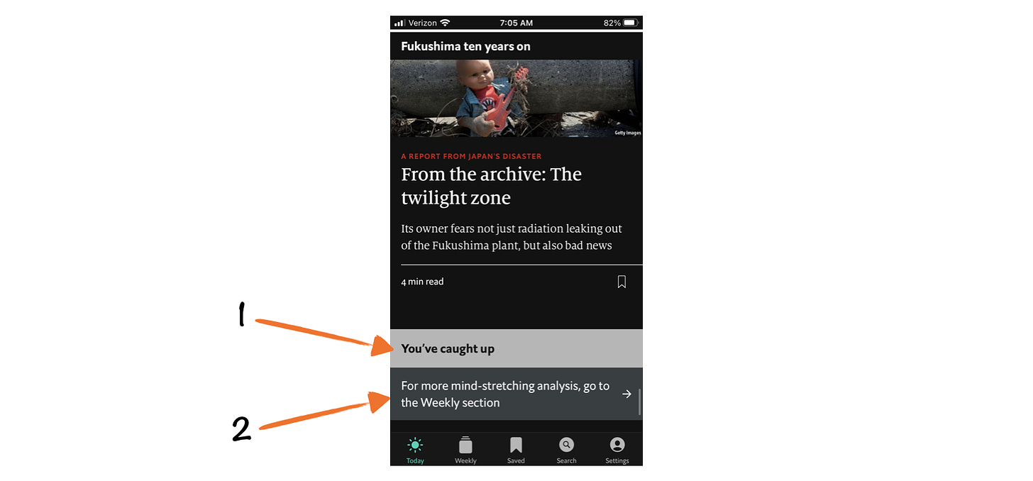
When you scroll to the bottom of the Today tab, which usually features 10-15 stories, you'll see a message that will feel familiar if you’ve used Espresso: You've caught up.
From there, you’ll notice a call-to-action directing you to the weekly tab to explore more content. Within the weekly tab, subscribers can scan all articles from the latest edition, and browse past editions. This tab is essentially how The Economist originally tackled digital. It provides the depth and breadth that subscribers have come to know and love and allows them to peruse the archives.
While some subscribers surely prefer navigating the wealth of content themselves, the natural flow of the app helps guide readers that might otherwise find the volume overwhelming, reducing decision-fatigue and helping them decide where to start, what to read, and what to save for later.
Levels of Curation
If you’re a long-time Economist reader, you may be thinking that curation has always been key to their value prop. I would fundamentally agree with you, however, what I find interesting are the levels of curation, and how they productize each.
The first level requires The Economist to determine what is newsworthy on a weekly basis. This is how they get to the ~75 stories that fill each weekly issue. This is a muscle they’ve honed over nearly two centuries in circulation. As they found, this level of curation doesn’t translate perfectly to digital. With a physical magazine, readers can scan and bookmark as they see fit, and serendipitously find articles they’re interested in. This is hard to replicate in an app experience.
This is where the second level of curation comes in: the Today tab. By honing the top stories of the day, the editorial team does the hard work for their readers, surfacing the stories they believe to be most important. However, even the Today tab, which features ~10-15 full stories per day, can feel like a lot.
That’s where the third and final level of curation comes in: Espresso, which distills their editorial efforts down to six 150-word briefs that can be finished in five minutes.
I love this concept of stripping an information product down to its essentials and offering it as a low-cost subscription and have found myself wanting Espresso for everything. Publishers like Bloomberg and the Financial Times immediately come to mind as expensive subscriptions that could benefit from a similar offering.
While modern newsletters like The Hustle and theSkimm built their audiences with daily curation and expanded their content offering from there, The Economist offers a playbook legacy publishers can leverage to retain subscribers by building their own curation muscle.
Enjoying Good Better Best?
If you enjoyed this post, I’d love it if you hit the like button up top, so I know which posts are resonating most!




Great article! I subscribed to the Economist Espresso after reading this post, if you had affiliate links I'd go out of my way to click them. Thanks for another piece!
Great content as always! This introduction is spectacular, what a perfect storytelling lesson you give.